The Challenge
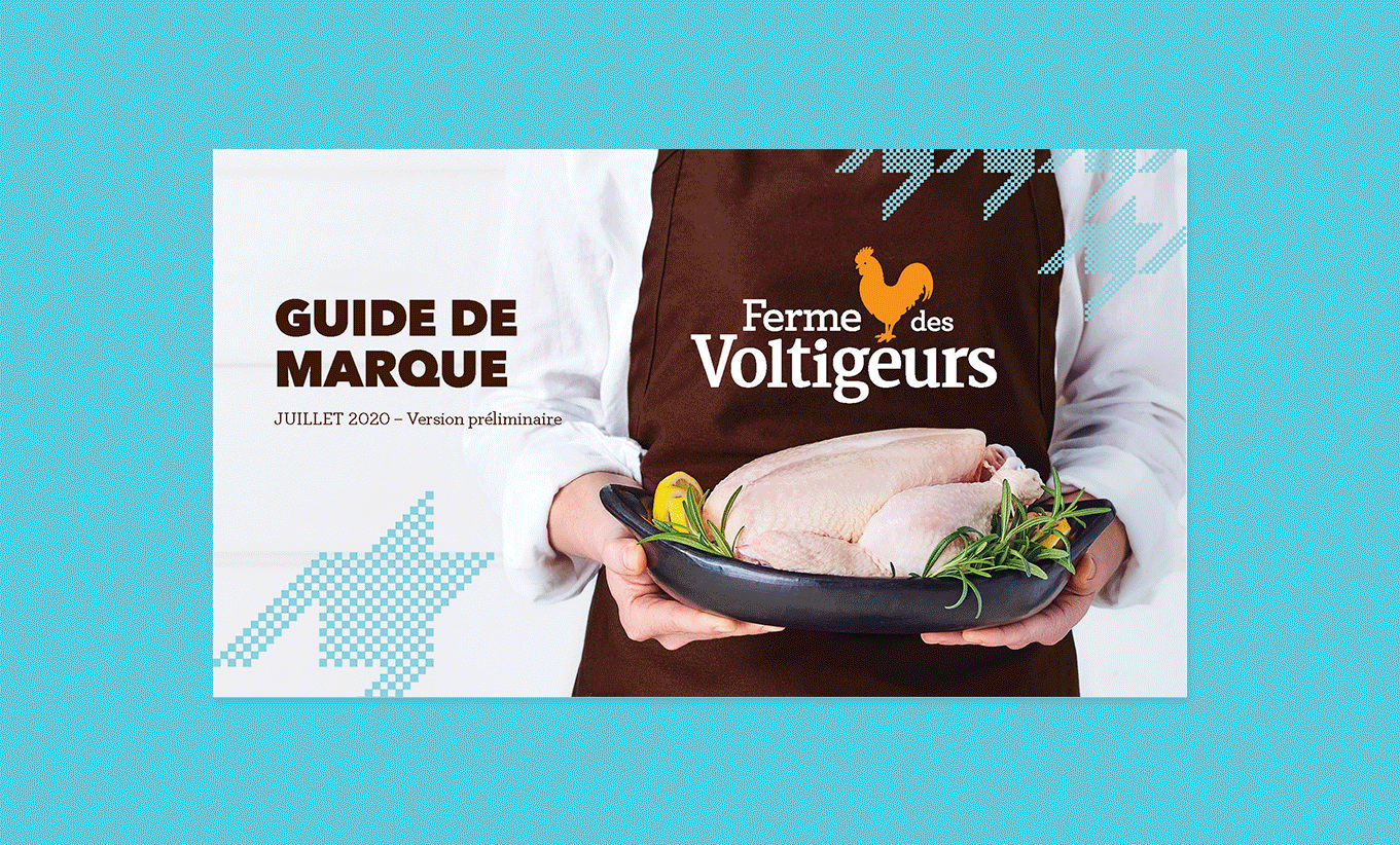
Established since 1958, Voltigeurs Farms is a local family-owned business that produces fresh poultry products with the most ethical and humane breeding and harvesting methods in Quebec. The market was dominated by two major players who controlled 94% of chicken production in Quebec., however it was mass-produced “industrial” chicken with little difference from what’s offered in generic packaging in the butcher’s aisle. Early on, Voltigeurs Farms adopted a very strict process that would set the bar high to produce vegetable grain-fed chicken without animal by-products, which has superior taste and nutritional qualities compared to traditional products. To continue to grow and take its rightful place, Voltigeurs Farms had to distinguish itself by asserting loud and clear its superior quality offer (best chicken in Quebec) and its intrinsic values.
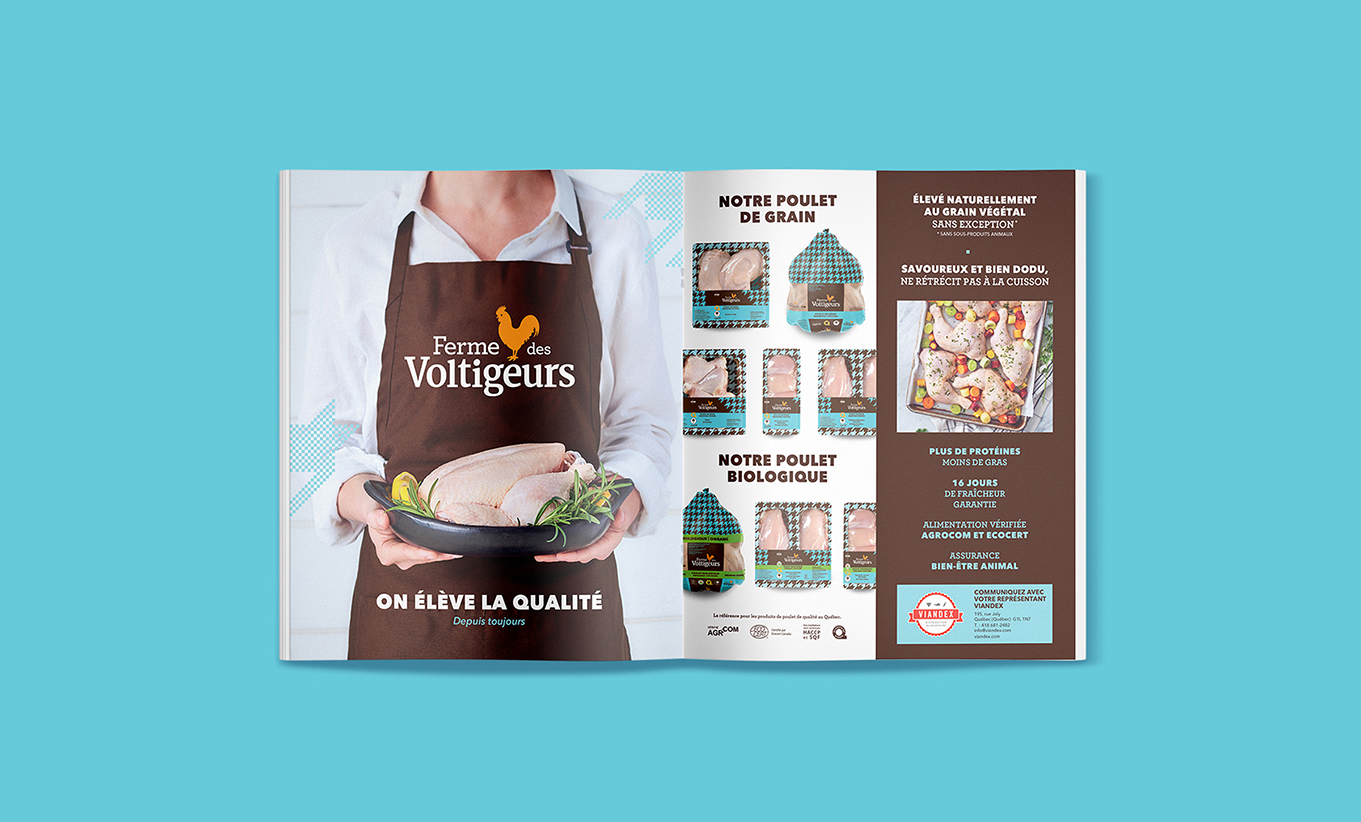
The Solution
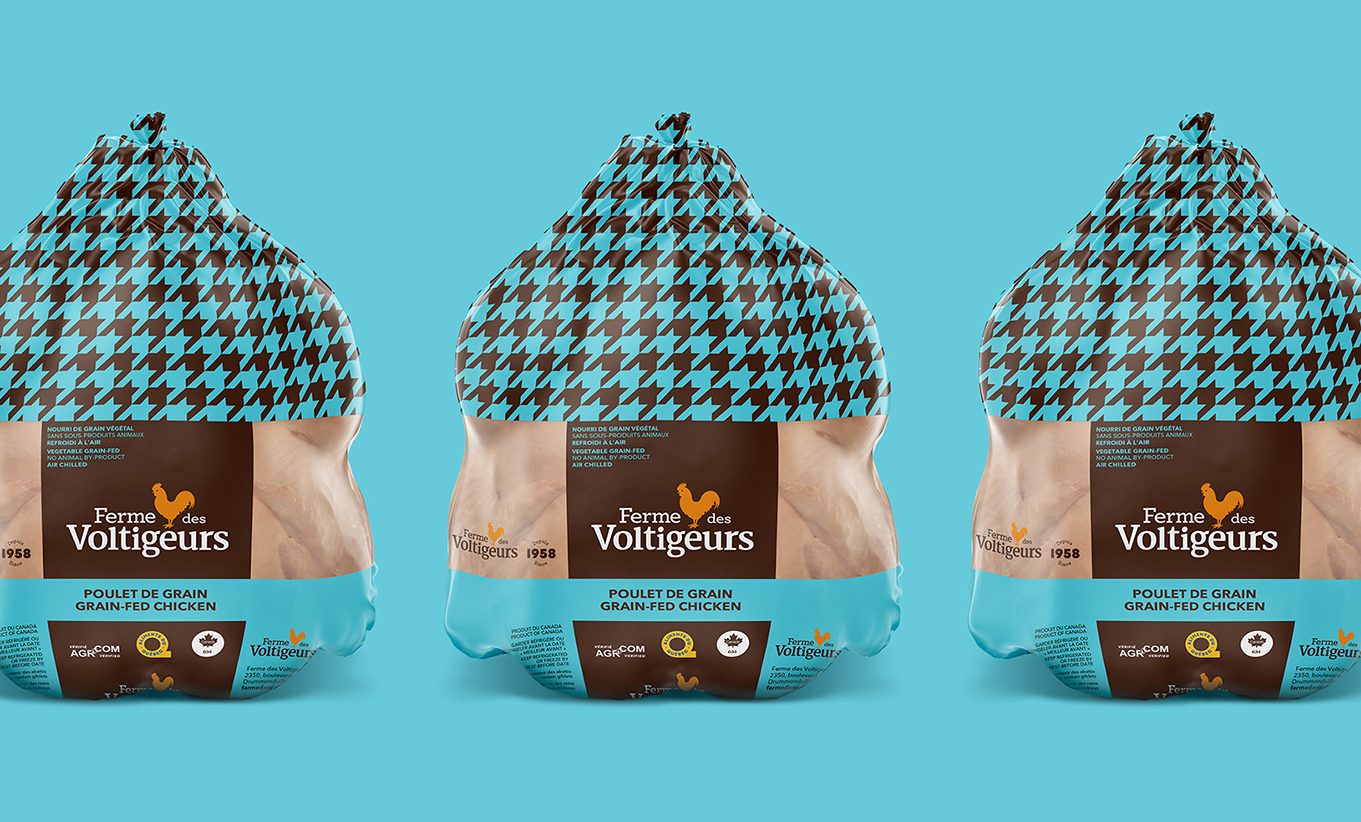
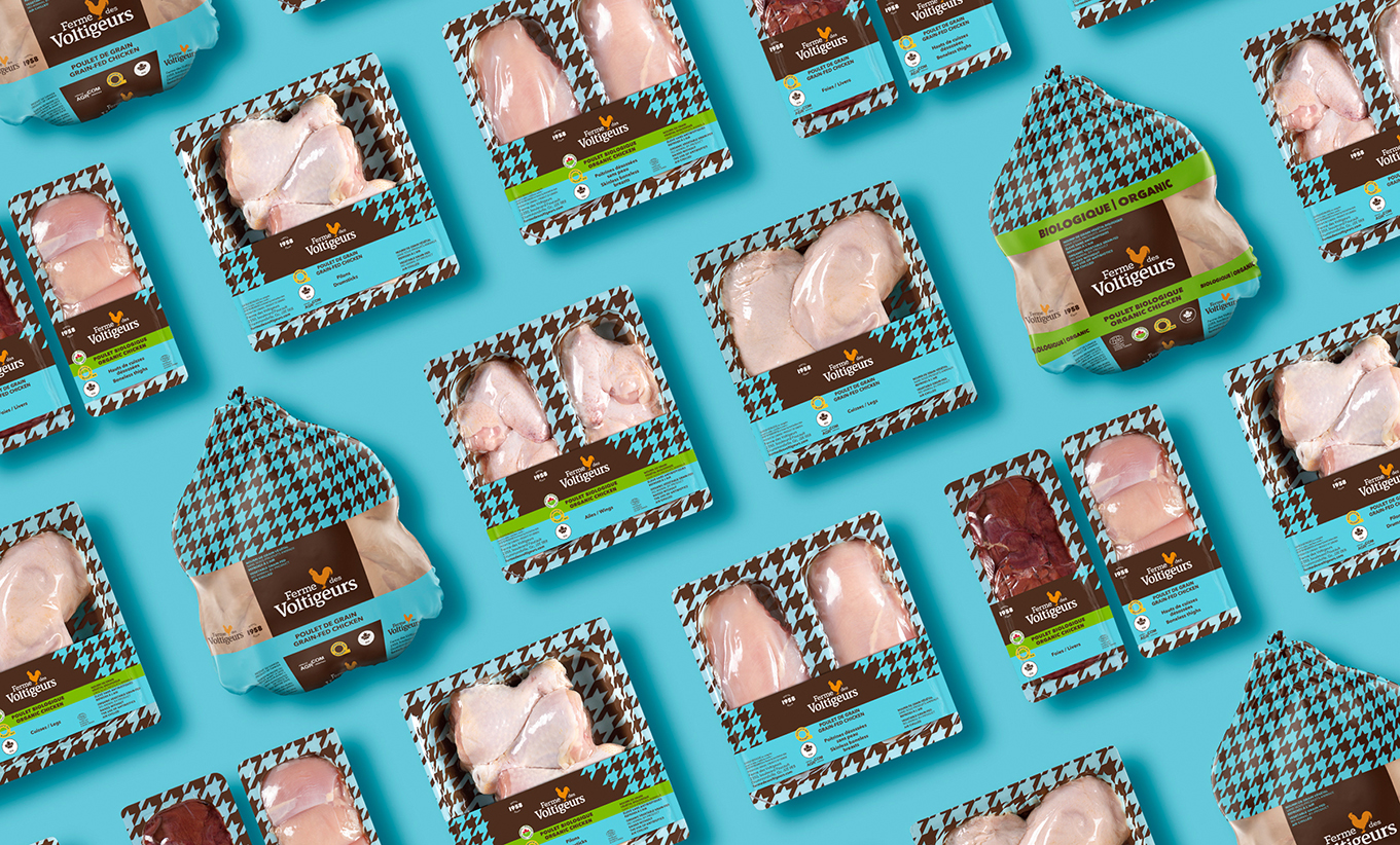
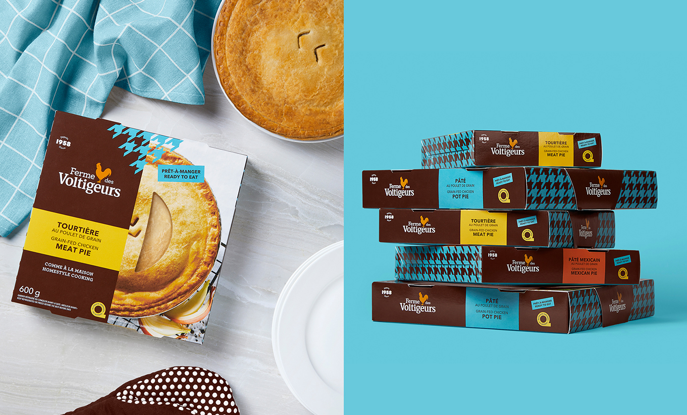
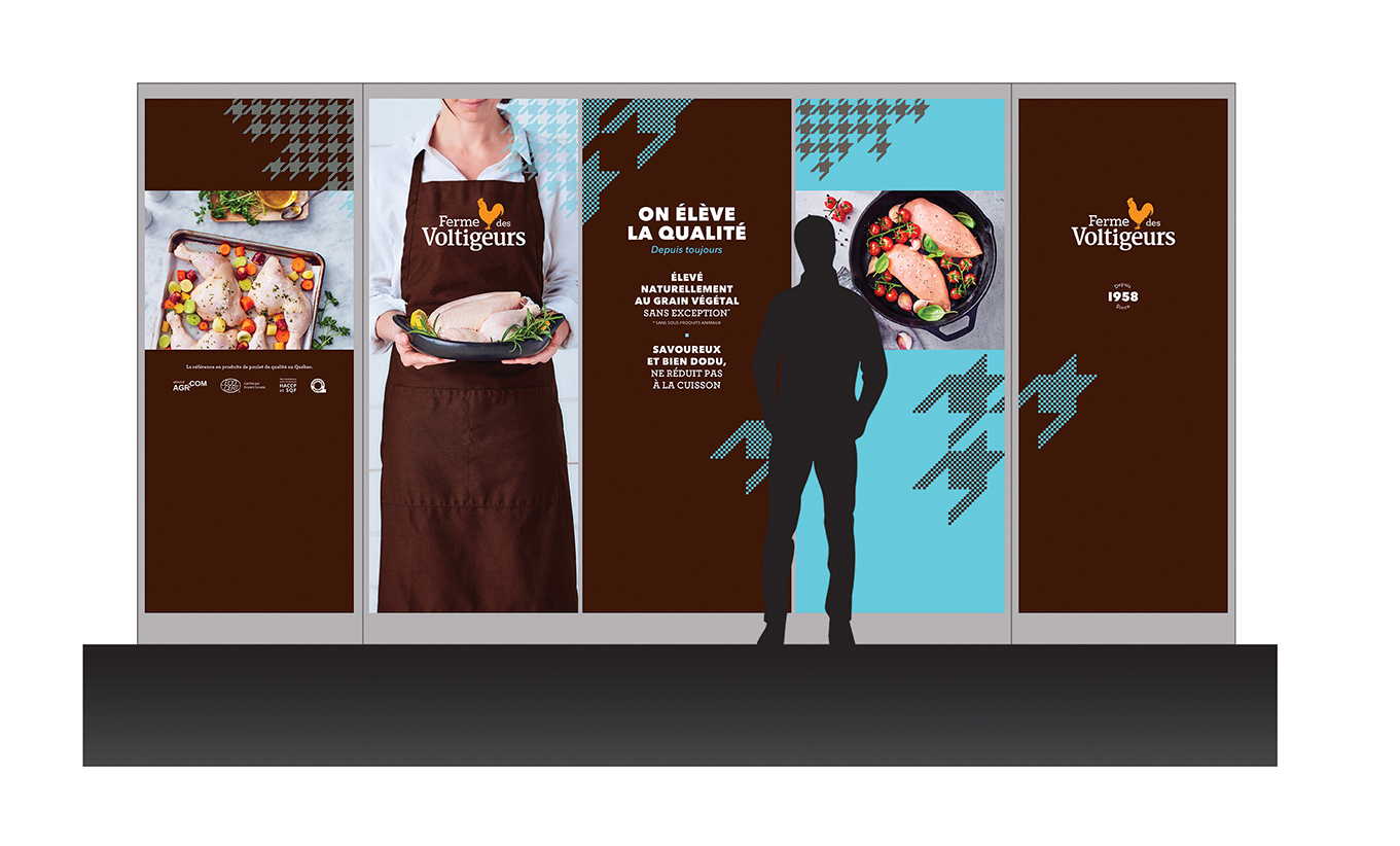
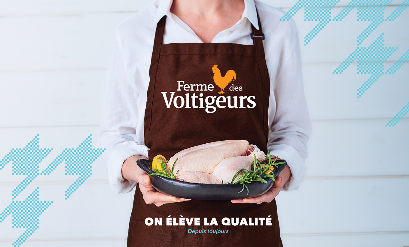
We developed the positioning “Chicken, as it should be” to guide the brand story. While remaining a humble and noble brand promise, the positioning highlights the superior quality of the product and the passion dedicated to it. We developed a package design system that reflects Voltigeurs Farms’ unique ways of raising chicken, beliefs, and certifications that are not established conventions of the category. We introduced a light teal color communicating freshness and adding contrast to the category, juxtaposed with a rich brown color to convey superior quality and equity. The hound’s toooth or «pied de poule» (which means means chicken feet in French) pattern (no pun intended) is also an integral part of the platform, bringing a unique nod to haute couture and premium feeling to the category. The emphasis on transparency was also key to show the brand had nothing to hide.