The Challenge
In an effort to engage with consumers and maintain relevancy within the growing, competitive segment of home furnishings, we undertook an overhaul of the IKEA flyer to evolve both visual and verbal content. Key to the success of this new approach was both in communicating IKEA’s vision and core principles and driving traffic to store / online and increasing basket size.
The Solution
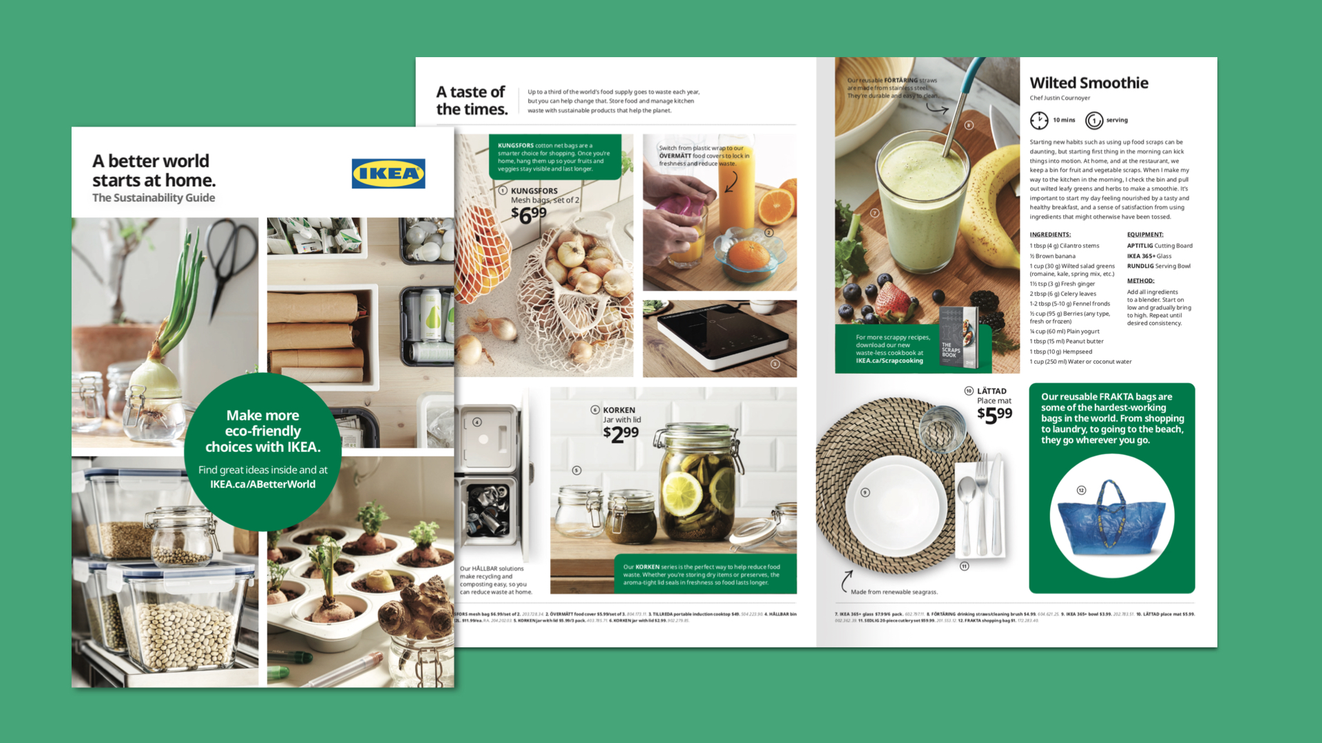
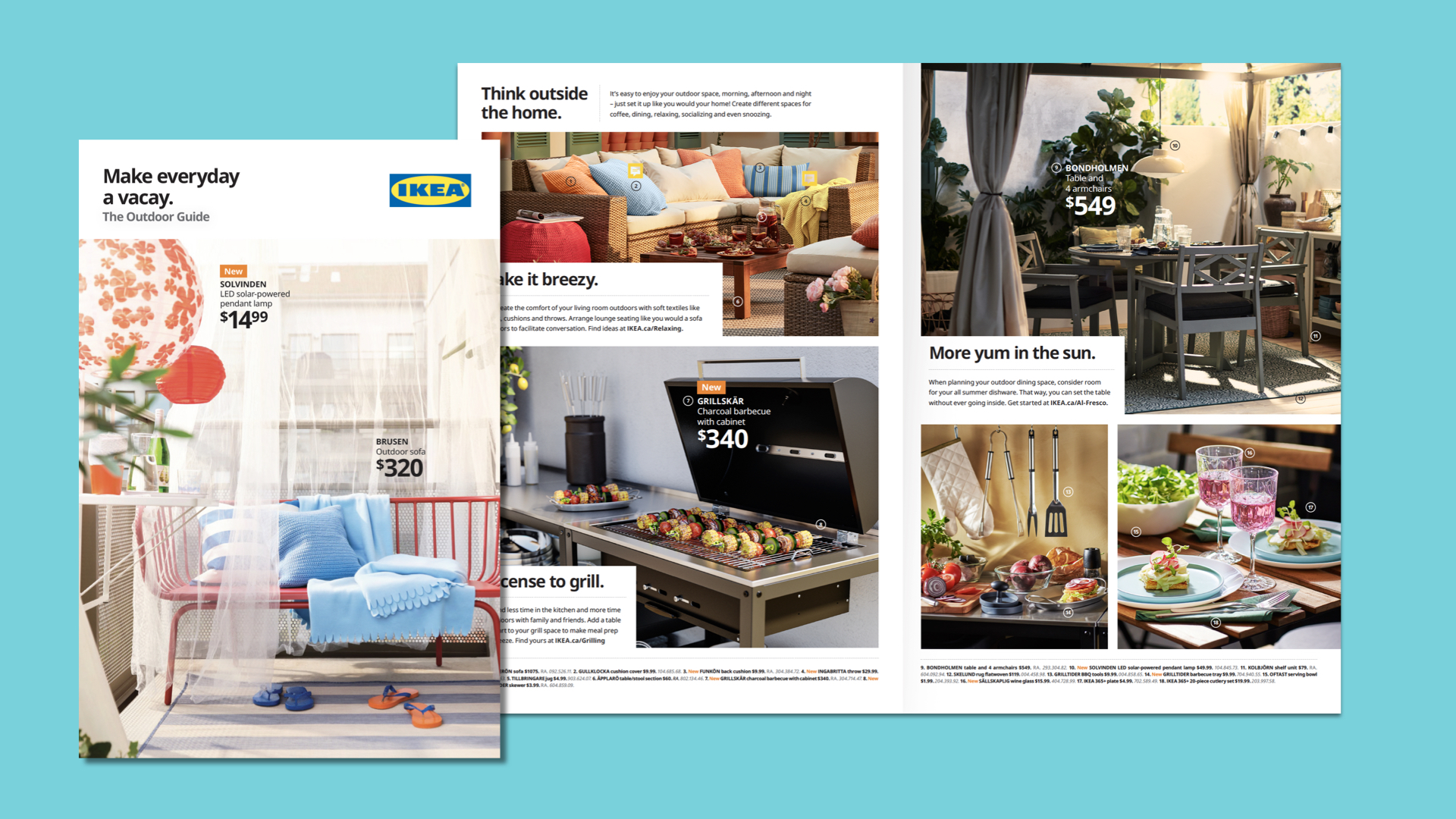
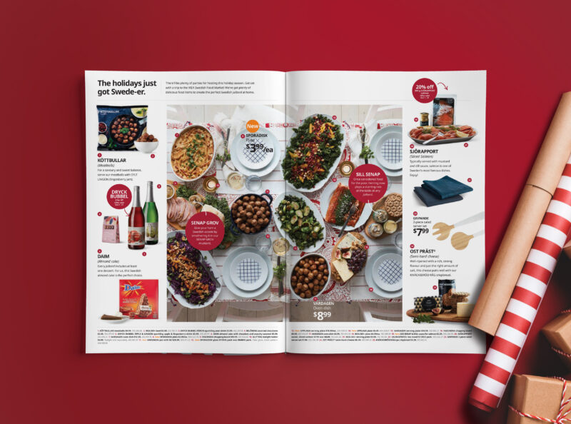
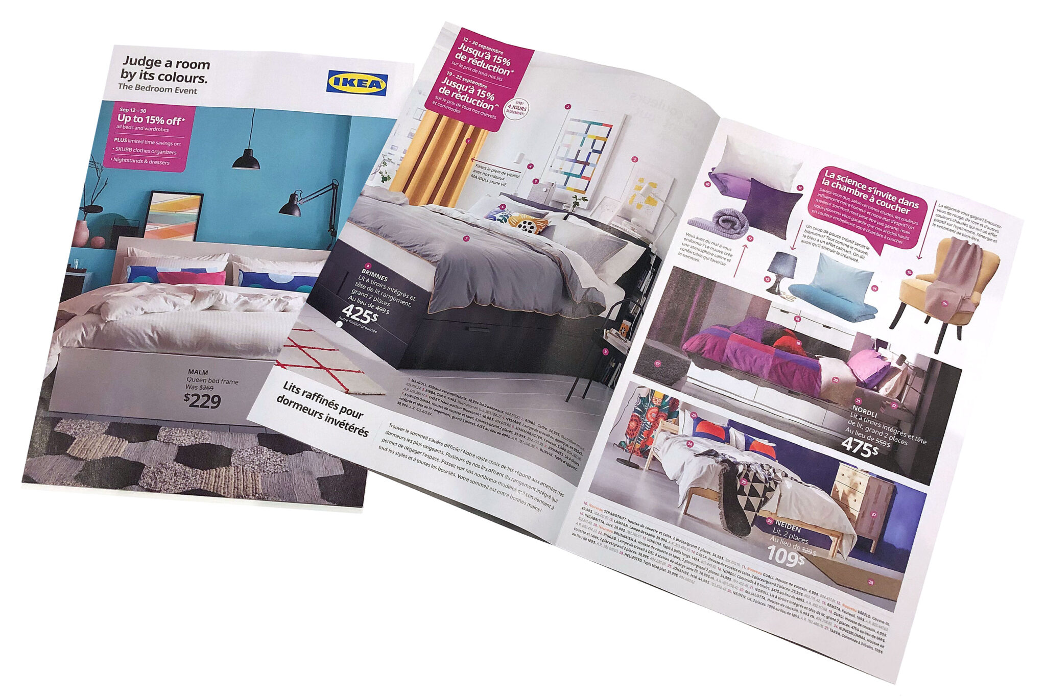
By creating the strategic pillars of Inspire, Inform, Instruct, Ignite, we were able to blend editorial content, aspirational decorating ideas as well as value-led messaging and deals within each flyer. We selectively curate from the vast library of IKEA images to ladder up to these pillars within each flyer. In addition, we create narrative that maintains the IKEA ‘twinkle’ and provide tips and tricks to inspire the consumer to achieve their renovation, decorating and sustainability goals and to help then live a better everyday life at home.
The Results
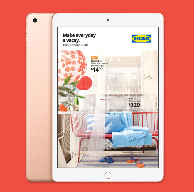
Research confirmed that 31% of consumers who read the IKEA flyer will subsequently make a trip to the store, a 9 point increase prior to the overhaul. In addition, IKEA flyers achieved very high recognition, were well-branded, highly eye-catching and engaged consumers in a very positive manner. And perhaps most importantly, 76% of consumers who see IKEA flyers in their mailbox/newspaper bundle read them. In our increasingly digital world this was particularly gratifying.