The Challenge
Develop the packaging platform of the new Danone GO drinkable yogurt targeting Gen Z. In the hopes of reaching more consumers, Danone found there was an opportunity to target Gen Z. Most other brands in the category target kids. We had to ensure our design would communicate the benefits (30% less sugar than the competition) while being authentic, cool, creative, and relevant to this new generation of consumers. The packaging design also had to take into consideration the Danone mother-brand design and heritage.
The Solution
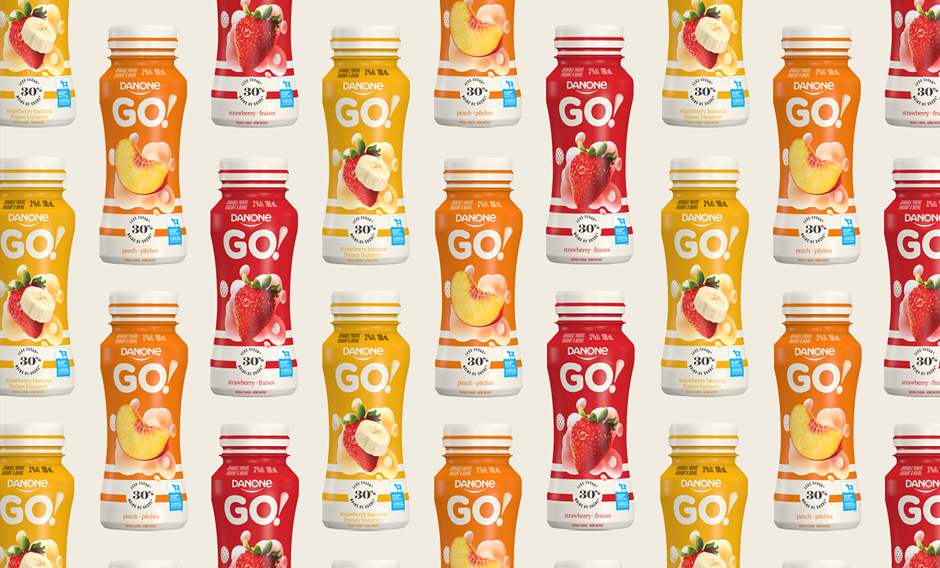
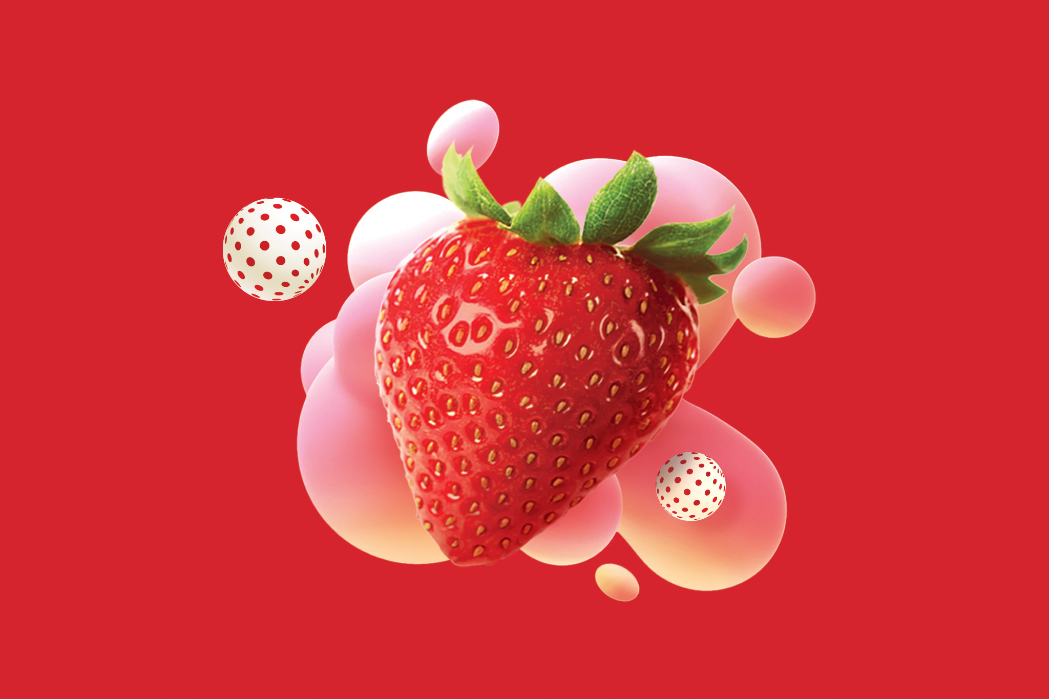
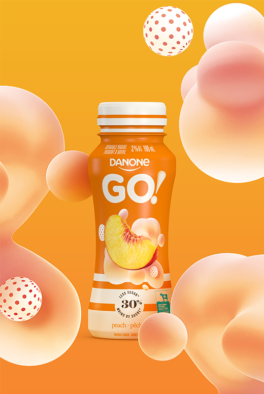
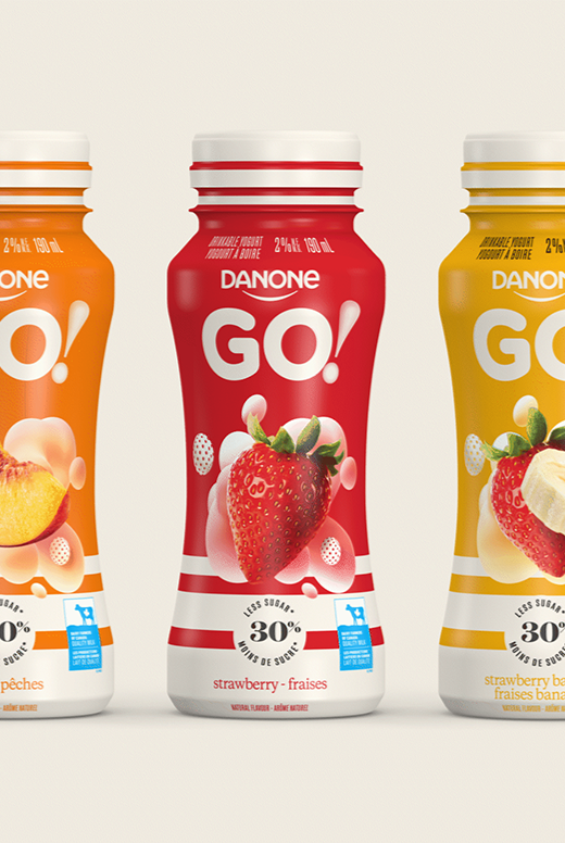
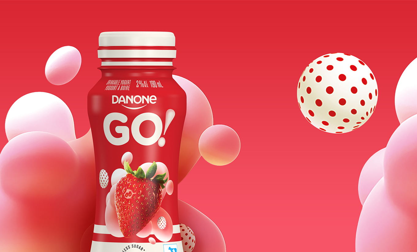
We designed the Danone GO! logo emphasizing the GO! to influence and inspire consumers to grab the product and GO! do what they wish to accomplish. We designed the packaging by considering design trends that would resonate with Gen Z. We included computer-generated images (CGI) of yogurt-like bubbles and polka-dotted spheres that are disruptive and not usually seen in the drinkable yogurt category. The 30% less sugar claim is displayed on the front panel and helps to communicate the better-for-you product offer.
The Results
The Danone GO! products have generated novelty and reinforce Danone’s character as an innovative partner with retailers in Canada. The better-for-you product offer made it possible to obtain listings in a majority of stores. So far, consumer feedback has been great on the product itself and the packaging design. Danone did a consumer test in February and results proved that purchase intentions were at 94% on Danone GO! products.
2021

2022