A Fresh Look for Fromagerie Perron
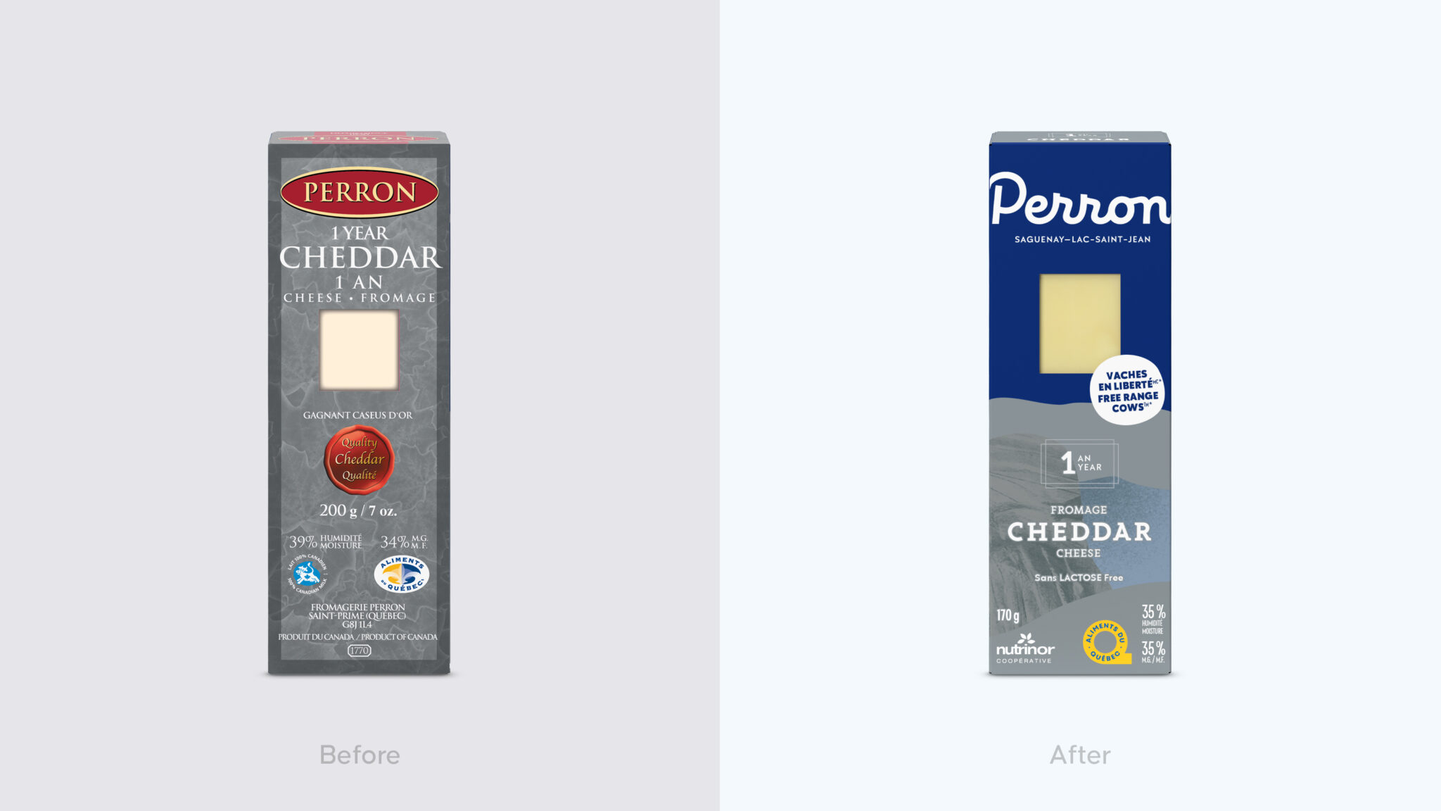
In a saturated market where cheese brands often struggle to stand out, Perron needed a clear positioning and a renewed image that would highlight the richness of its heritage, expertise, and values. Its leadership within the category also needed to be unmistakable in grocery store aisles.
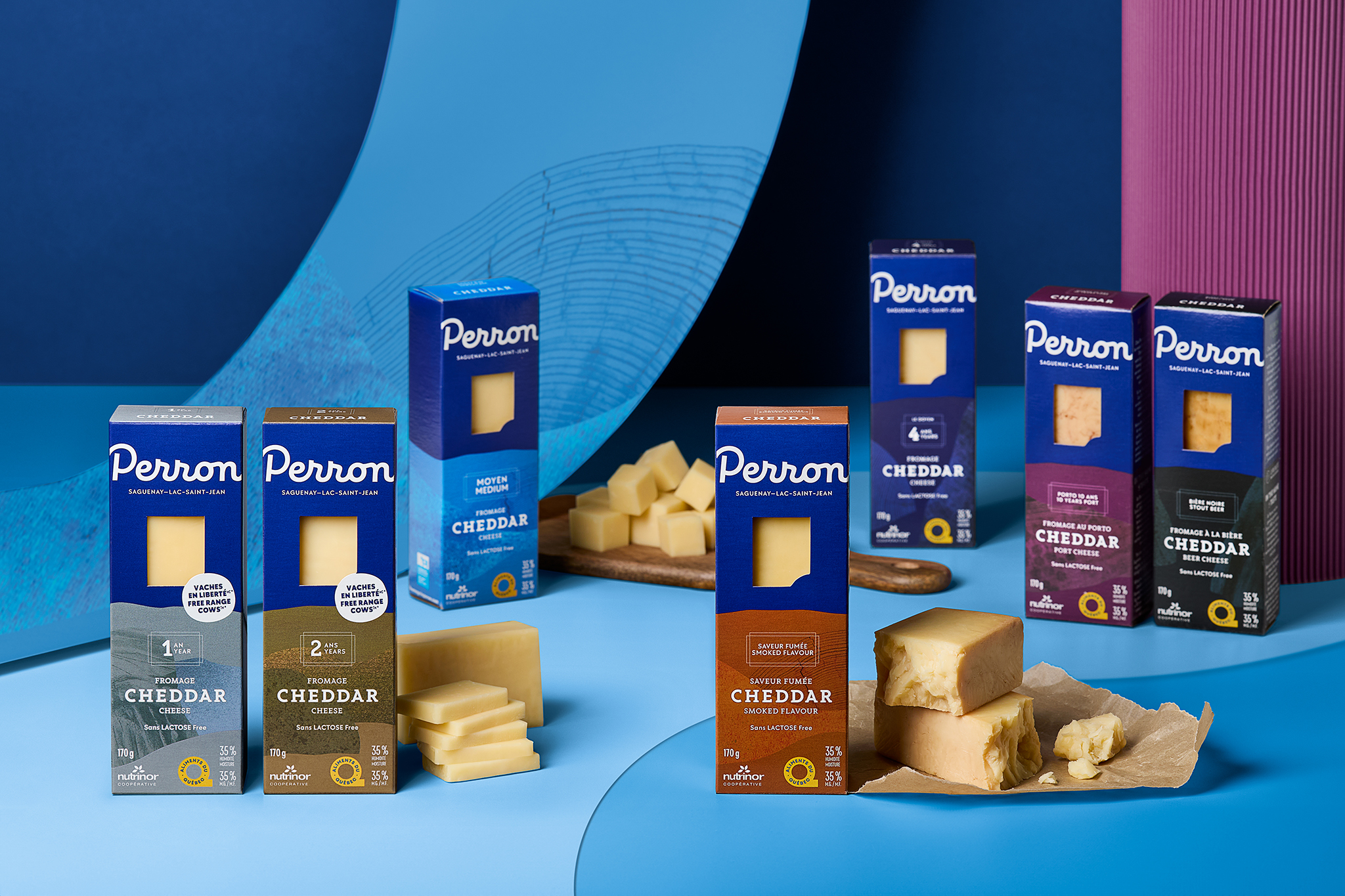
The goal was to reconnect the brand with its roots while projecting it into the future. Elevating the Fromagerie also meant shining a light on the Saguenay–Lac-Saint-Jean region, where it was founded back in 1903. The new platform had to express both the authenticity of the terroir and the family’s legendary know-how, as well as its pride in crafting products of uncompromising quality.
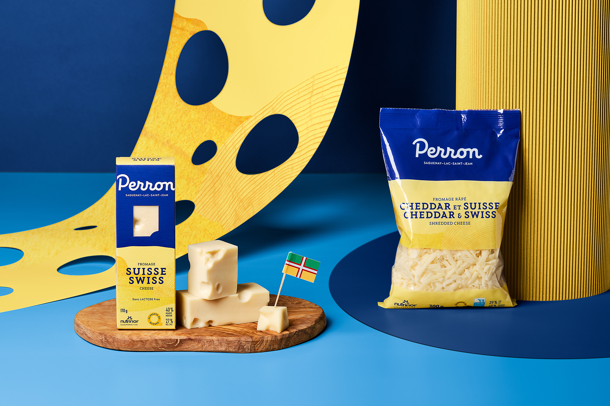
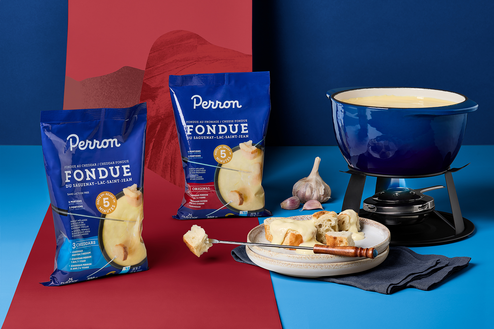
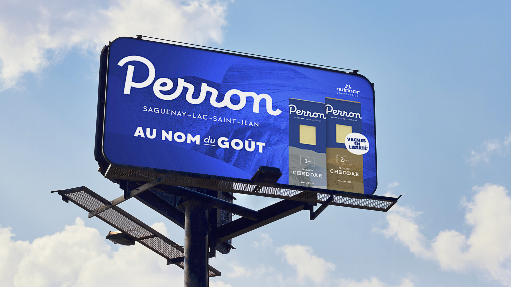
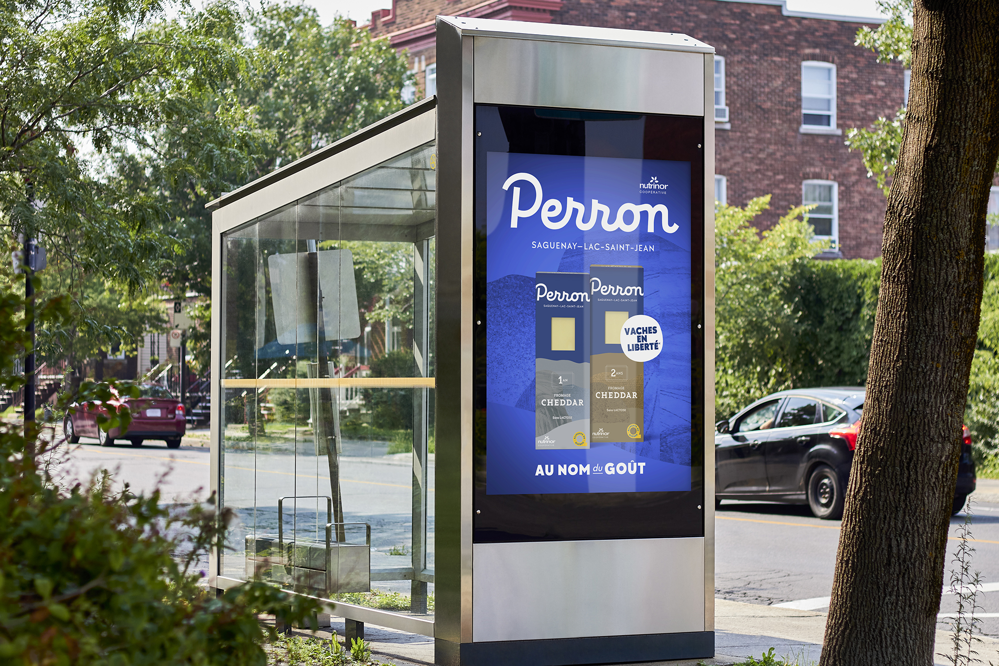
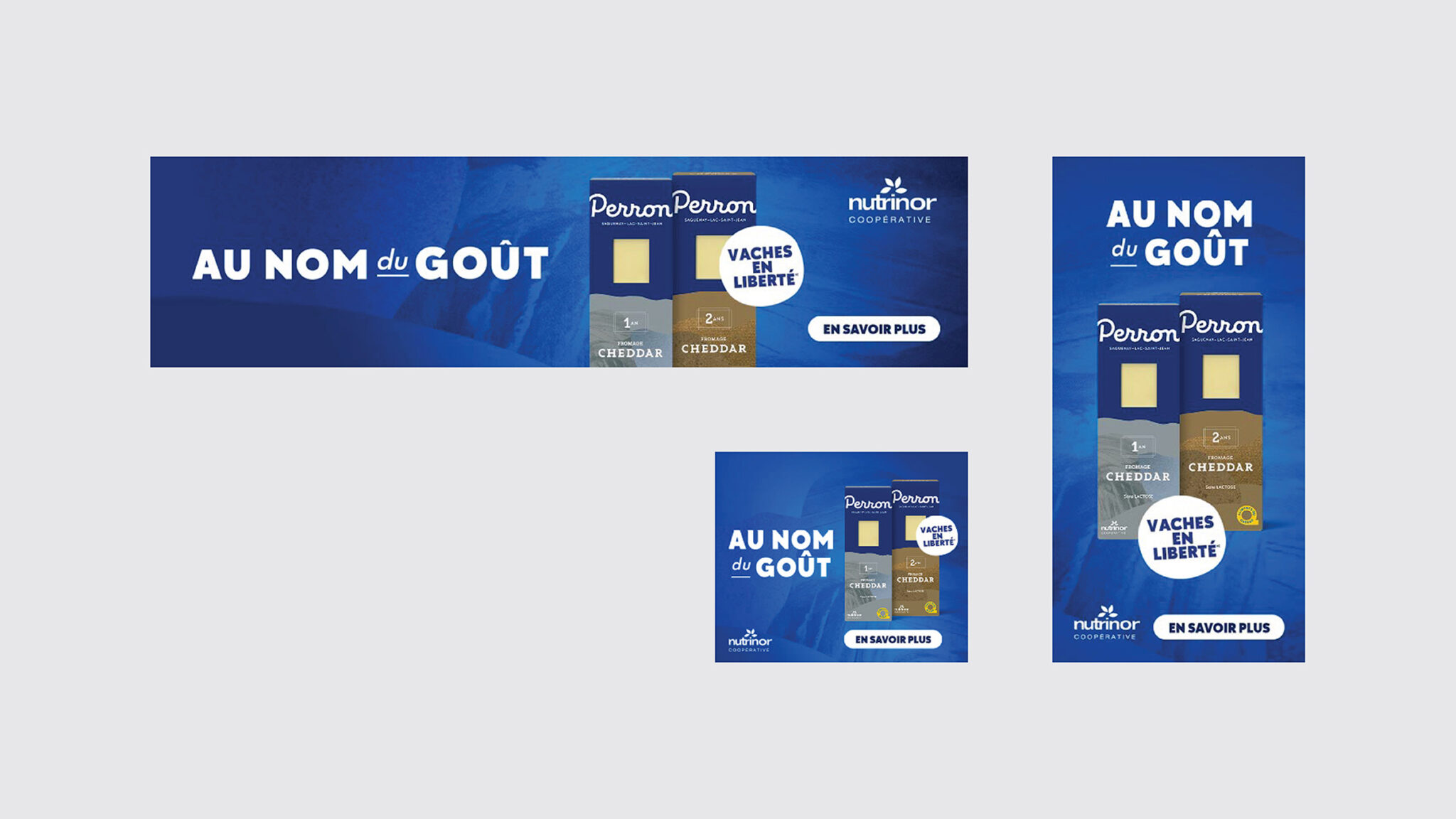
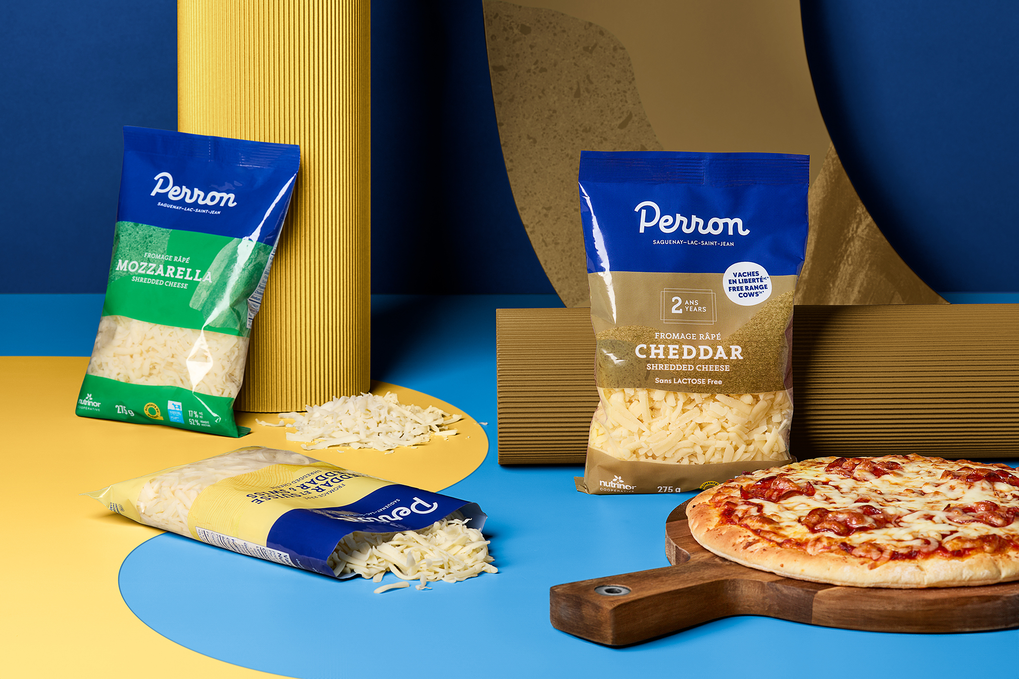
With the signature “In the Name of Taste,” we developed an identity that pays tribute to both Perron’s exceptional flavor and its enduring story. A deep blue was chosen for the visual universe, evoking the lake, while organic shapes recall the wind over the fields. The cursive typography reinforces the artisanal and profoundly human character of the brand.
This modernized identity was rolled out across packaging, a refreshed website, and an advertising campaign that marked the relaunch. With this breath of fresh air, the brand now speaks to a new generation while strengthening its bond with loyal epicureans.