The Challenge
Pigeon partnered with Bimbo Canada in 2019 to modernize the iconic Dempster’s brand and use subliminal packaging strategies to encourage trial. With these challenges in mind, we had to stay true to the brand’s heritage, retain loyal customers and ensure accessibility to all Canadians. In such a competitive market, how might we differentiate Dempster’s products and grab the attention of customers shopping on autopilot?
The Solution
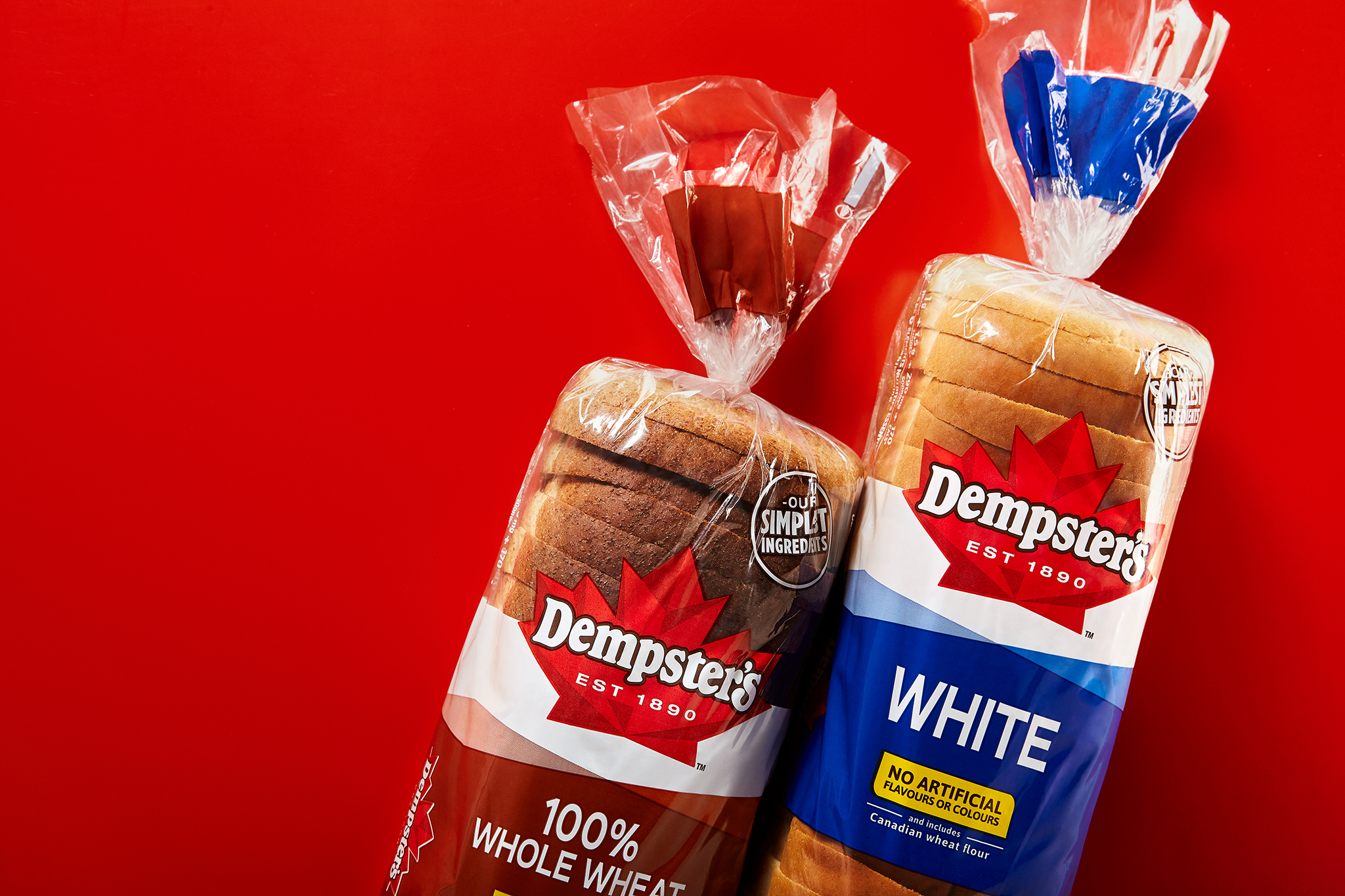
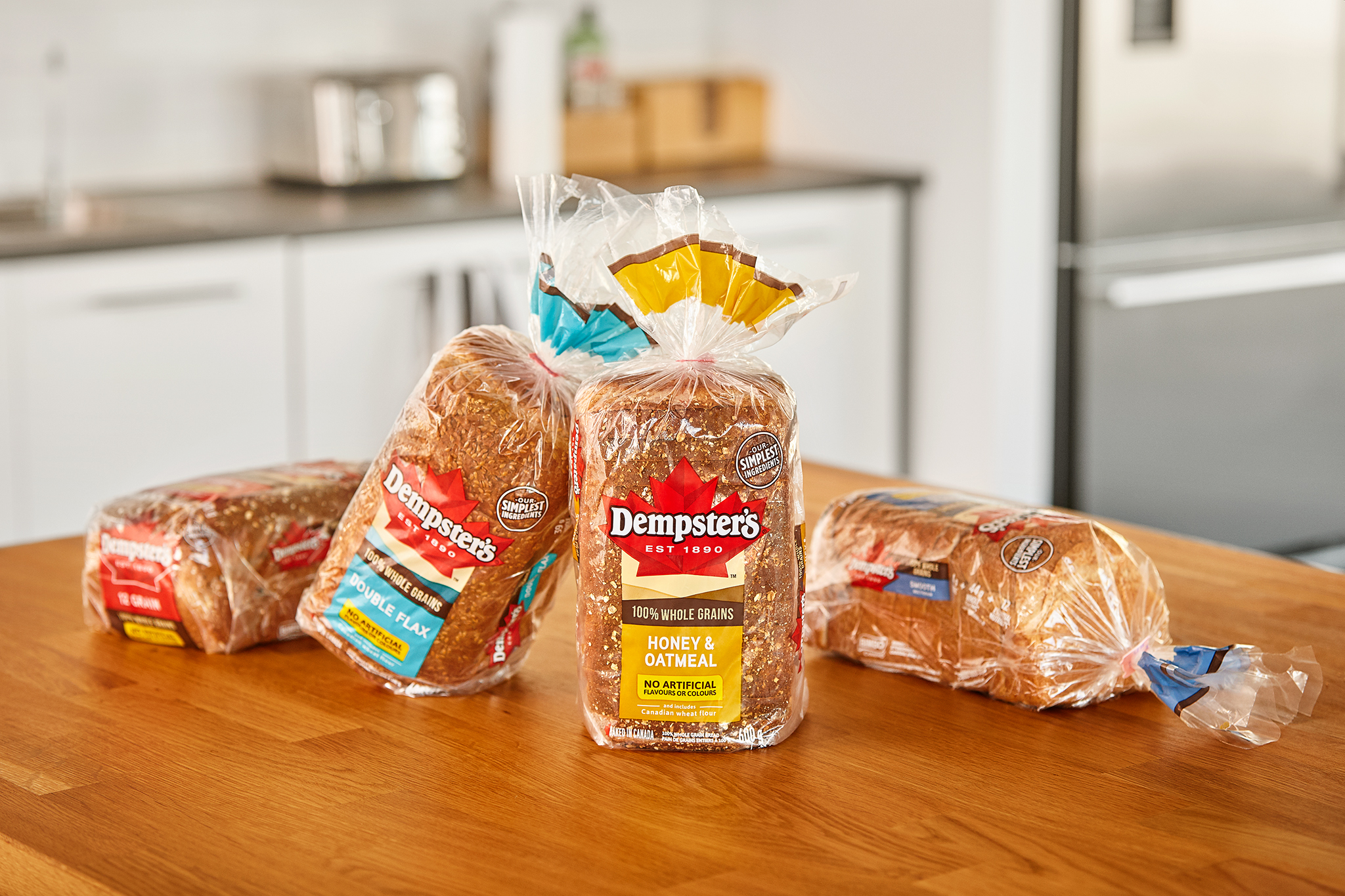
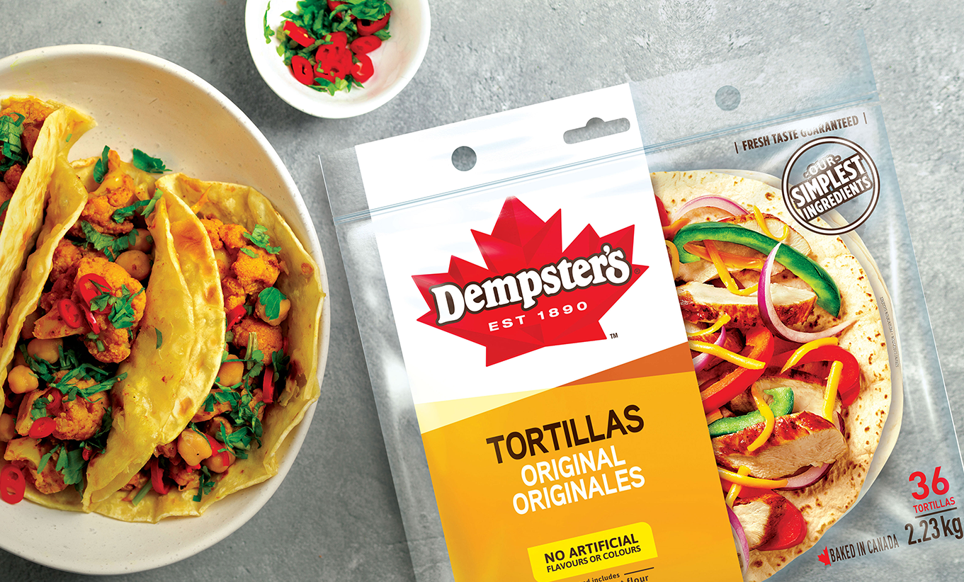
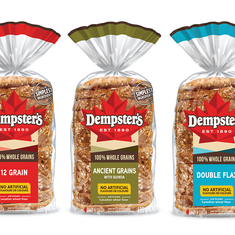
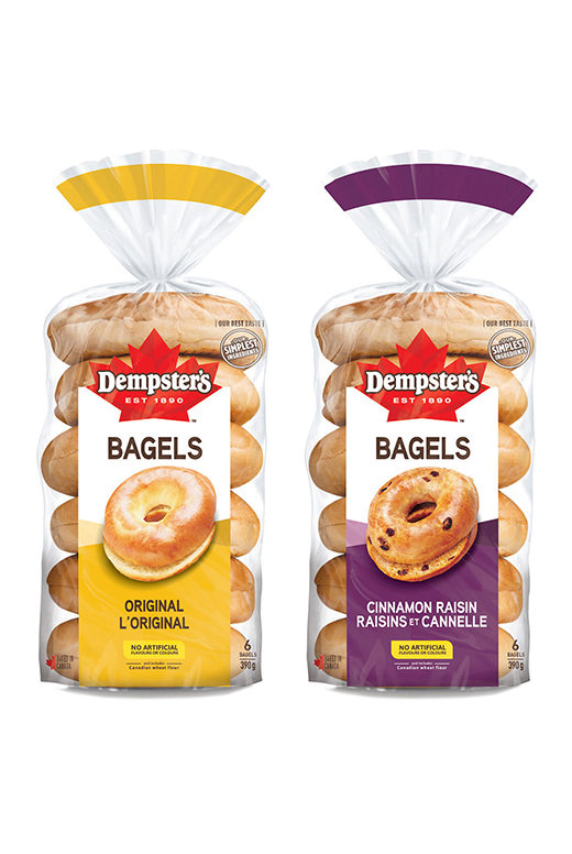
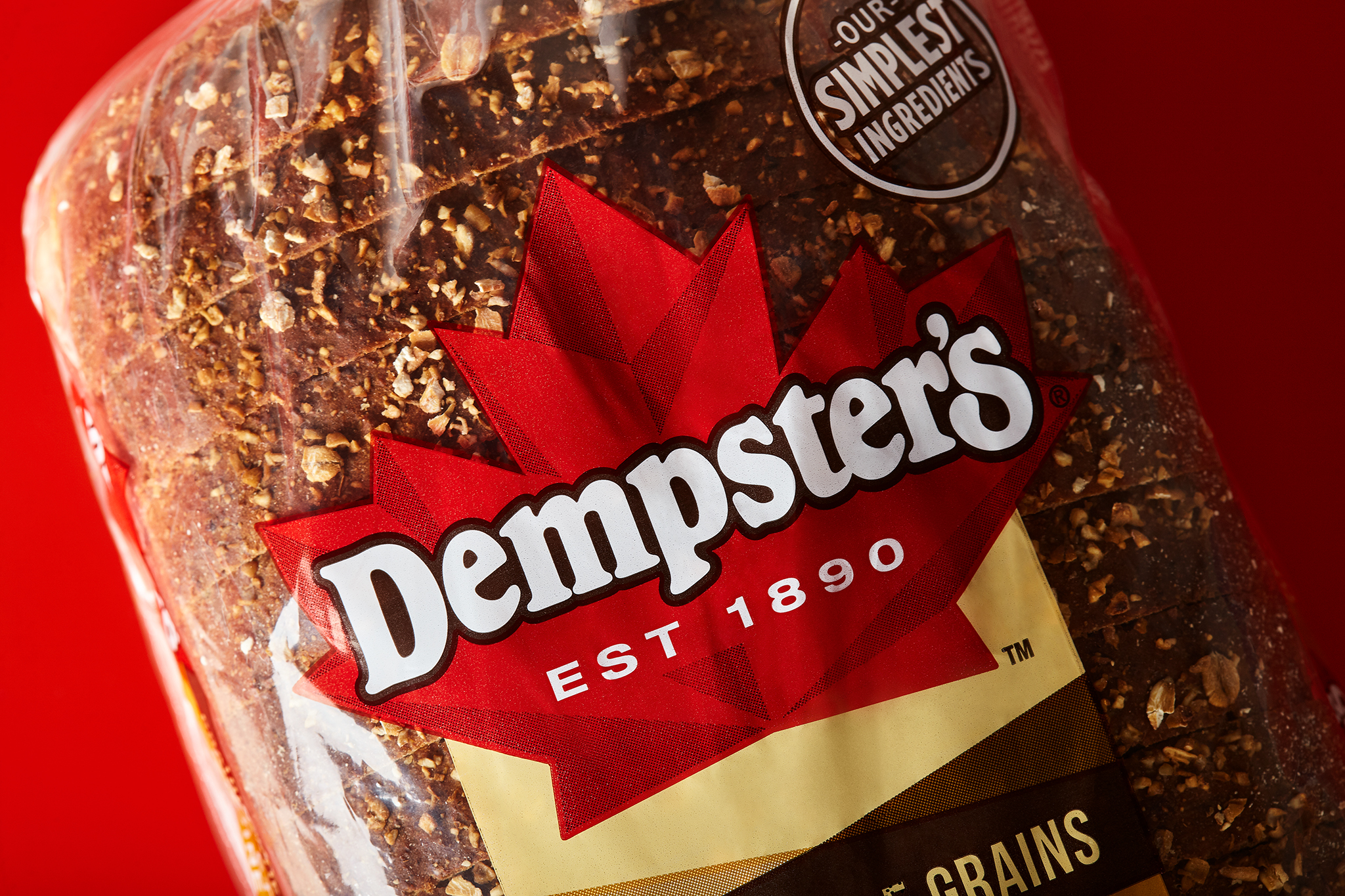
To securely position Dempster’s as a Made by Canada brand, we leveraged Canada’s most entrusted symbol, the maple leaf, and used supporting messaging to highlight the importance of Canadian wheat flour and the heritage of over 100 years as Canadian bakers. Additionally, we redesigned a cohesive graphic system to bring all of the subcategories together by using modern, bold geometric elements on pack and a systematic approach to delineating the format and flavour with a cohesive colour palette. This strategy allowed for strong brand blocking and differentiation among other competitors.
The Results
Historically, the packaged bread category in Canada is relatively flat. However, in March 2020, due to COVID-19, at-home consumption changed the commercial bread landscape and drove a +10% growth in consumer expenditure. Dempster’s outpaced the industry growth within the same time frame and attained an impressive brand-wide growth rate. Another strong indicator of ROI for the Dempster’s redesign is a big gain in household penetration for the commercial bread category.